top of page

Role
UX/UI Designer
Team
Andrew Baek - Designer
Hemel Parmar - Creative Director
Nick Xu - Sales Director
Jessica Hernandez - Marketing Coordinator
Tool
Figma, WordPress, Adobe CC
Project Overview
Milkyway Glass is an e-commerce startup specializing in glass accessories for cannabis users. I played the main role in bringing solutions for the new website design by integrating data-driven insights, strategic SEO enhancements, and collaborative marketing efforts.
This initiative achieved remarkable success in boosting site visibility, simplifying navigation, and enhancing the customer experience, leading to significant increases in sales and engagement metrics.


Problem statement
The Milkyway's website suffers from unintuitive navigation, lack of engaging content, and poor mobile optimization, creating friction for users and weakening customer connection.
-
Highlights


-
Impact
Success proven
Driving growth
Website Sale
more in monthly revenue
40-60%
The website redesign led to increased traffic, higher engagement, and boosted conversions, driving measurable growth in revenue.
Website Visitors
58%
145.8k
Website Views
23%
907.02k
Average Engagement Time
38%
2m18s
-
Discover
Explore Milkyway Glass
Understanding the brand
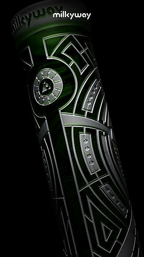
Milkyway Glass is an online head shop dedicated to crafting premium sandblasted glass pieces that combine high quality, stunning designs, and exceptional functionality.
Brand Products
Previous Website


-
Problem
Identifying the challenges
Why change was needed
Milkyway Glass encountered several challenges that impacted user engagement, website performance, and overall business growth.
Great products,
not so great website
Despite offering exceptional products, Milkyway Glass's website was held back by complex navigation, outdated visuals, and the lack of engaging content that hindered the user experience.
Front Page

1.
The navigation is overly complicated, with repeated content in the "Shop" menu.
2.
The CTA lacks enough clarity, making it unclear what happens when clicked.
3.
The visuals are not appealing due to outdated content and poor legibility.
Shop Page
4.
The filter is overly complex and not mobile-friendly, as it lacks a collapsible option.
5.
There is insufficient product information, such as reviews and ratings.

Product Page

6.
There are too many buttons, lacking clear organization by purpose and function.
7.
Insufficient product information and a lack of SEO optimization.
Low engagement metrics
1m 53s
Average Engagement Time
The website lacked engaging content, such as a loyalty program and influencer collaboration initiatives, which are key to building a deeper connection with customers and driving long-term engagement.
50%
Bounce Rate

1.6%
Conversion Rate
-
Questions
Driving the redesign
How might we statements
1.
How might we simplify navigation to make it more intuitive and reduce friction for users?
2.
How might we redesign the website for more engaging content, such as a loyalty program and influencer collaborations, to strengthen customer connection?
3.
How might we optimize the website to ensure a seamless experience for the mobile environment?
-
Research
Deep dive into insights
Gathering data
Identifying key areas for improvement and guiding design decisions was crucial. I worked closely with the marketing coordinator to conduct research and gather insights.
Observe user behaviours
We focus on analyzing user behaviour through heat maps, and scroll maps, providing valuable insights into how users interact with the site and highlighting areas for improvement in the user experience.
Heat Map


Scroll Map


Identify the journey
I also developed a user journey map outlining key touchpoints and experiences. It was crucial to understand better how users navigate opportunities for improvement.

-
Solution
Crafting the answer
From Insights to Innovation
I focused on enhancing usability, improving navigation, and prioritizing key content for better engagement. Updates to customization tools and collaboration features boosted visibility and sales. Guided by user insights and SEO optimization, the redesign achieved measurable growth in traffic, engagement, and revenue.
Easier navigation
Streamlined the navigation bar and implemented enhanced filtering options to find products.


Improved Content Placement
Strategically placed key content and call-to-actions above the fold for users who don’t scroll extensively.
Loyalty program / Combo Creator

UGC Content


More intuitive product filter
The new product filter design was developed to simplify and enhance the shopping experience by providing users with intuitive filtering options.
SEO optimization
To improve organic search rankings and enhance discoverability, SEO principles were applied to all product descriptions.

Milkyway Rewards page
I designed this program page to encourage repeat engagement and customer retention. Milkyway Rewards turns every interaction into a rewarding experience, strengthening the connection between the brand and the customer.


Mobile optimization
Focusing on mobile optimization, the redesign ensures a seamless and intuitive experience across all devices. By prioritizing speed, responsive design, and easy navigation, I improved usability for mobile users.


-
Takeaways
Final thoughts
-
Enhanced User Experience: I focused on prioritizing user needs, resulting in a smoother, more engaging experience across all devices.
-
Strategic Growth: By incorporating key features like mobile optimization, SEO, and collaboration opportunities, I helped drive measurable growth in traffic and engagement.
-
Brand Visibility: Through the collaboration campaign, I was able to elevate the brand’s presence and reach a wider audience.
-
Long-Term Impact: The improvements I implemented lay the foundation for sustained success, ensuring ongoing customer satisfaction and future business growth.
Next project

RESPONSIVE WEBSITE DESIGN
O3 Drinkware
Eye-catching design solution for the glass drinkware brand O3.
bottom of page